The complete guide to creating a Confluence wiki
Share on socials
The complete guide to creating a Confluence wiki

Jump to Section
Jump to section
What is a wiki?
Confluence wiki vs knowledge base
Why use Confluence for your wiki?
Create a Confluence wiki in 5 steps
Confluence wiki best practices
Unsure what a Confluence wiki is, or how to create one? Here’s how to use Confluence as a wiki with our 5-step guide.
Is your business using Confluence as a wiki yet? If not, why not?
Confluence is the perfect internal - and external! - wiki software. With real-time collaboration, inline comments, and a range of privacy and permission settings, Confluence helps knowledge workers easily gather and share information - even when teams are spread across the globe.
Here's exactly what you need to consider before building your Confluence wiki.
What is a wiki?
A wiki is an online collaboration tool that usually resembles an open-editing web page or website. Users can add, change, or remove content on any page they have permission to edit.
When used in place of (or alongside) an intranet, a wiki improves teamwork and collaboration across your organisation. It acts as a single source of truth for company updates, documentation and resources, and becomes even more powerful when tailored to individual teams and projects.
Learn more: What is a wiki?
What's the difference between a wiki and a knowledge base in Confluence?
While sometimes the terms are used interchangeably, there are actually some key differences between wikis and knowledge bases. In Confluence, these differences are mainly related to the level of collaboration allowed and the structure of the Confluence space.
Confluence wikis let users freely collaborate, meaning any employees are able to pool their knowledge and create content together. It also has a more informal structure that evolves over time, with users adding content in a more ad-hoc way. There is minimal gatekeeping over who can add and edit information.
On the other hand, Confluence knowledge bases are more structured and formal. They tend to follow a standardised structure and hierarchy, and they also limit editing privileges to a select few. These practices help to keep the information accurate and relevant.
It's ultimately up to you to decide whether to use Confluence as a wiki or knowledge base - though your organisation can have both!
Why use Confluence for your wiki?
When you build your wiki, you'll likely be uploading sensitive information, have many collaborators, and need to tailor the platform to your company’s needs. This requires a secure, flexible, and responsive solution - which is where Confluence comes in.
Confluence integrates with many other popular tools, is highly customisable, and boasts high levels of security. It's suitable for large and small businesses and has inbuilt templates and interactive add-ons (known as macros), making it an all-rounder for a company wiki.
Most importantly, Confluence has a variety of features that make collaboration a breeze, such as real-time page editing, commenting, and live activity feeds to keep everyone on the same page.
How to create a Confluence wiki: 5 steps for success
1. Define your business requirements
To begin, you should ask what business problem you want to solve.
Is your aim to create a streamlined internal hub where colleagues receive general company updates? Or is your requirement more function-specific? Maybe you want to create channels where your teams can work productively together, host documents, and report back on their progress. Confluence can be used effectively in all of these scenarios - as long as it's clearly structured and organised.
Is your aim to create a streamlined internal hub where colleagues receive general company updates? Or is your requirement more function-specific? Maybe you want to create channels where your teams can work productively together, host documents, and report back on their progress. Confluence can be used effectively in all of these scenarios - as long as it's clearly structured and organised.
2. Identify the information you want on your wiki
Confluence is designed to evolve and grow over time, but it's a good idea to have a core structure in place before you create your wiki. This makes it much easier and quicker for users to navigate, even after your wiki expands.
It's also worth considering the types of content that belong on your wiki. For example, is the wiki a place for sharing meeting notes, project documentation, and collaborative drafts while you keep company updates and employee onboarding on a separate knowledge base?
If you're setting up team hubs within your wiki, create a brief for each department that explains what they should contribute to set up their Confluence space. This could include profiles, strategy documents, and project overviews.
Summary:
- Consider what types of content will belong on your wiki, and where they will sit.
- Optional: brief each department on how to contribute to their area of the wiki.
💡 Top tip: When you're adding team pages to a Confluence wiki, you might want to create a Confluence template to share with each department. This makes it easier to keep your wiki looking consistent while letting other users choose the content they add.

A Confluence wiki can link to resources such as guides, step-by-step tutorials, and sales enablement
3. Think about your structure and organisation
Confluence administrators often struggle with organisation. In large companies with frequent updates, maintaining a clear wiki structure is a challenge. It’s critical to understand not only what you want your wiki to be used for, but also how users will interact with it.
Consider drafting a site structure that sets out the hierarchy of your spaces and pages and how they will connect. Think about the main groups you want your content and teams to be split into.
For example, a homepage links separate hubs for HR, marketing, sales and project management, and these link out to team project pages. Your Confluence wiki will naturally grow over time, but an established structure helps to group relevant information together in years to come.
Summary:
- Plan your core wiki structure.
- Create a draft of your structure with the main hierarchies mapped out.
💡 Top tip: Set up labels in Confluence to categorise your pages based on their content. Labels make it much easier for users to find related pages.
4. Create a dedicated space (and pages) for your Confluence wiki
When building your new wiki, you'll want to create a new Confluence space. That way, you can start with a clean slate free of any clutter, which helps you put your plan into action.
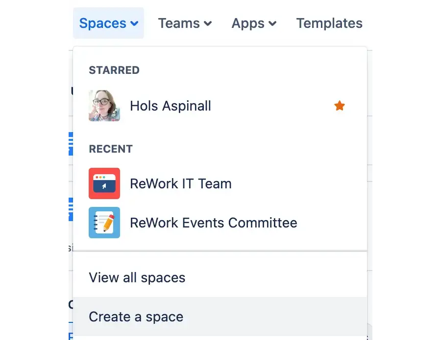
To create a new space, just click the Spaces dropdown in the top menu, then choose Create a space. You can choose from a range of Confluence space templates or start from scratch with a blank space.
To create a new space, just click the Spaces dropdown in the top menu, then choose Create a space. You can choose from a range of Confluence space templates or start from scratch with a blank space.

From here, you can create a new page for every separate piece of information. Simply click + New in the top Confluence bar, then Page.
5. Use the right tools to enhance your Confluence wiki
Once you've created a space, it's time to build your wiki. Confluence has plenty of built-in tools, called macros, to help you get started.
Some macros that might be useful include:
Some macros that might be useful include:
- Expand - this is a collapsible section in Confluence that lets users hide or show relevant information.
- Panel - the Panel macro highlights text in a colourful box, which is useful for drawing attention to important information.
- Table of Contents - this macro automatically creates a table of contents in your Confluence page, helping users to navigate.
External apps like Mosaic: Content Formatting Macros & Templates are invaluable, helping you to organise your Confluence content, make it more readable, and add interactive, engaging elements to your pages.

Macros like Buttons and Cards help visualise content, while Tabs and Tooltip macros keep information organised. A range of Confluence apps are available to improve the wiki user experience - read our guide on essential Confluence plugins to learn more.
Confluence wiki best practices
These best practices will help you create a Confluence wiki that's user-friendly and supports knowledge sharing across the company.
1. Conduct user testing as you build your wiki to make sure it meets the aims of the project. Here are a couple of questions to ask yourself:
- Are users engaged?
- Can they navigate easily, and is it clear what they need to do on each page?
2. Create guidelines to keep your wiki pages consistent. You could set conventions such as:
- Naming conventions - use descriptive titles and follow a certain format to make pages easier to find.
- Avoid complex language - keep your wiki easy to understand by avoiding jargon and abbreviations where possible. If it’s unavoidable, use a Confluence tooltip to provide extra information.
- Follow a consistent format - set guidelines for using brand colours, suitable imagery, and layout to keep your wiki consistent. You can even use a Confluence template to make things easier!
3. Get creative! Use interactive elements like buttons and forms to encourage people to get hands-on with the wiki. Colours, imagery, and branded content can make your wiki more attractive and engaging to readers.
It's over to you!
A Confluence wiki is the ideal way to share knowledge within your company. With the right planning, organisation, and creativity, you're ready to get started!
How will you style your Confluence wiki?
Mosaic: Content Formatting Macros & Templates make it easy to structure and style Confluence spaces however you want. See for yourself with a 30-day free trial 👇
Related Content
Read moreWritten by
Related Content
Read more


