How to use colour palettes for consistent Confluence branding
Share on socials
How to use colour palettes for consistent Confluence branding

Jump to Section
Jump to section
How to consistently brand Confluence pages
How to create a colour palette in Confluence
Why does consistent Confluence branding matter?
Brand consistency is just one step
Keen to make your Confluence branding more cohesive? Discover how colour palettes can help your pages look polished and professional.
Confluence is built as a collaboration tool and, as such, it’s natural for multiple creators to contribute to its pages. However, this collective effort can often make content feel mismatched and sometimes even jarring.
Thanks to the handy colour palette feature from Mosaic: Content Formatting Macros & Templates, users can easily create content that feels like it belongs together.
Thanks to the handy colour palette feature from Mosaic: Content Formatting Macros & Templates, users can easily create content that feels like it belongs together.
How to consistently brand Confluence pages
Confluence only offers 18 shades, so unless you’re very lucky, your brand colours are going to be missing. Thankfully, Mosaic comes with a built-in brand palette feature that lets you assign your brand colours and apply them to a range of visual macros.

How to create a colour palette in Confluence
Note: In order to follow these steps, you need to be a Confluence admin. If you’re not one, reach out to your Confluence admin and send them this guide.
1. Install Mosaic: Content Formatting Macros & Templates.
2. Click the cog icon in the top-right corner of Confluence. This will take you to administration settings.
1. Install Mosaic: Content Formatting Macros & Templates.
2. Click the cog icon in the top-right corner of Confluence. This will take you to administration settings.

3. In the left-hand sidebar, under 'Mosaic', select 'Manage Color Palettes'.

4. From the 'Manage Color Palettes' screen, click 'Add new palette'.

5. Create your palette:
- Give it a name (something that will make sense to users, such as your brand or product name).
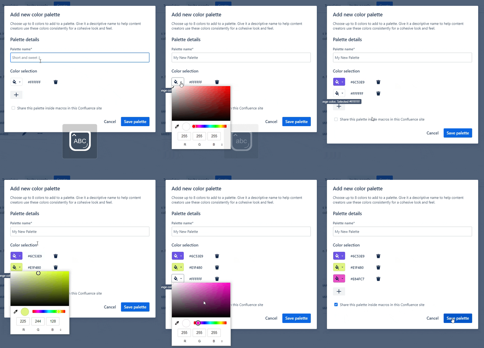
- Add up to seven colours by pressing the + button. Either add a hex code (with or without #) or select the colour using the eyedropper tool.
- Choose to share the colour palette with the visual macros by checking the box beneath the colours. You can save a palette without sharing it if it's not yet ready for use.
See how to do it with the gif below: 👇

6. Press 'Save palette'. That’s it! Your new colour palette is ready to use.
⚡ Pro tip: You can also create custom palettes that are specific to one space. Just go to your Confluence Space settings > 'Look and feel' (in the sidebar) and then set your palette in the 'Macro colours' tab.
⚡ Pro tip: You can also create custom palettes that are specific to one space. Just go to your Confluence Space settings > 'Look and feel' (in the sidebar) and then set your palette in the 'Macro colours' tab.
Why does consistent Confluence branding matter?
Consistent colour branding in Confluence helps create a more cohesive and effective user experience. Here are some reasons why it’s so useful:
Brand (and product) recognition: Consistent colours in line with brand guidelines helps users to recognise and identify your brand. If your brand has multiple products with distinct identities, it also helps users to easily distinguish product-related content in an instant.
Professionalism: A consistent colour scheme contributes to a professional and polished appearance. It also demonstrates that your organisation takes its branding seriously, which can improve the credibility of your content.
Brand cohesion: In a collaborative environment like Confluence, where multiple users may contribute to content, consistent colour branding ensures that the visual identity of your brand remains cohesive, no matter what.
Brand consistency is just one step
Cohesive brand colours matter, but it’s important to ensure your content itself is engaging and interactive too. Otherwise, users won’t engage with it anyway!
Whether you want to create a Confluence team page or a Confluence knowledge base, our in-depth guides will help you design content that teams will read and remember.
Whether you want to create a Confluence team page or a Confluence knowledge base, our in-depth guides will help you design content that teams will read and remember.
Create engaging, branded pages with Mosaic
Whatever you’re creating, Mosaic for Confluence can help you achieve your vision. Discover the benefits with a 30-day free trial:
Related Content
Read moreWritten by

Senior Product Marketing Manager
Zoriana has over 12 years of experience in marketing, with 6 of them in product marketing management. As a Senior Product Marketing Manager, Zoriana aims to ensure Kolekti's apps excel by understanding customer needs, solving their problems, and making Kolekti truly the best solution.
Related Content
Read more


