How to make a Confluence team page that keeps everyone connected
Share on socials
How to build a Confluence team page that connects everyone

Jump to Section
Jump to section
How to create a Confluence team page
Step 1: Create your team space
Step 2: Add content to a new page
Step 3: Customise your team page
[BONUS] Get our team page template
Why create a Confluence team page?
New member on your team? Help them settle in smoothly with a well-crafted Confluence team page.
Starting a new job can be daunting. There's so much to take in - from remembering all the new faces to absorbing the vast amount of information in onboarding documents, and beyond.
With around a third of new hires quitting within the first three months of joining, it's clear that this early stage is a make-or-break moment for many. The good news is that managers can fix this by giving new hires all the information and support they need to get off to a good start. One of the best ways to accomplish this is with a team page in Confluence.
🚨 Please note: This guide is for Confluence Cloud. 🚨
How to create a Confluence team page
Before you begin:
First, you'll want to figure out what could go on your page. Start by looking at what other teams are doing in Confluence. What are their pages like? What structure would you like to follow? What elements could you copy or take inspiration from?
Gather all the information you already have, update any documents, delete anything you don't need, and note anything you're missing. This part can feel a bit tedious when you want to just get going, but it's always worth investing the time to get things in order first.
Ok, now you've tidied up, it's time to start creating!
Step 1: Create a space for your team page
If your team page will live in an existing Confluence space, navigate to this space. Then press '+ Create' in the top bar and select 'Page' in the dropdown. If you need a new space, follow the steps below.
1. Click on the 'Spaces' button in the Confluence top menu and select 'Create a space'.

2. Choose a blank space or a ready-made template. Remember that even if you choose a template, you can still make it your own! We'll be using the Collaboration template.

3. Give your space a name, and choose or upload a space icon. You can also create a space key and change the space permissions if you wish. Press 'Next'.
⚡️ Pro Tip: To hide your space from team members while you work on it, just change the permissions to 'Only visible to me'. When you’re finished, you can change the permissions from 'Space settings' in the space sidebar.
For more information, read our guide on creating Confluence spaces.
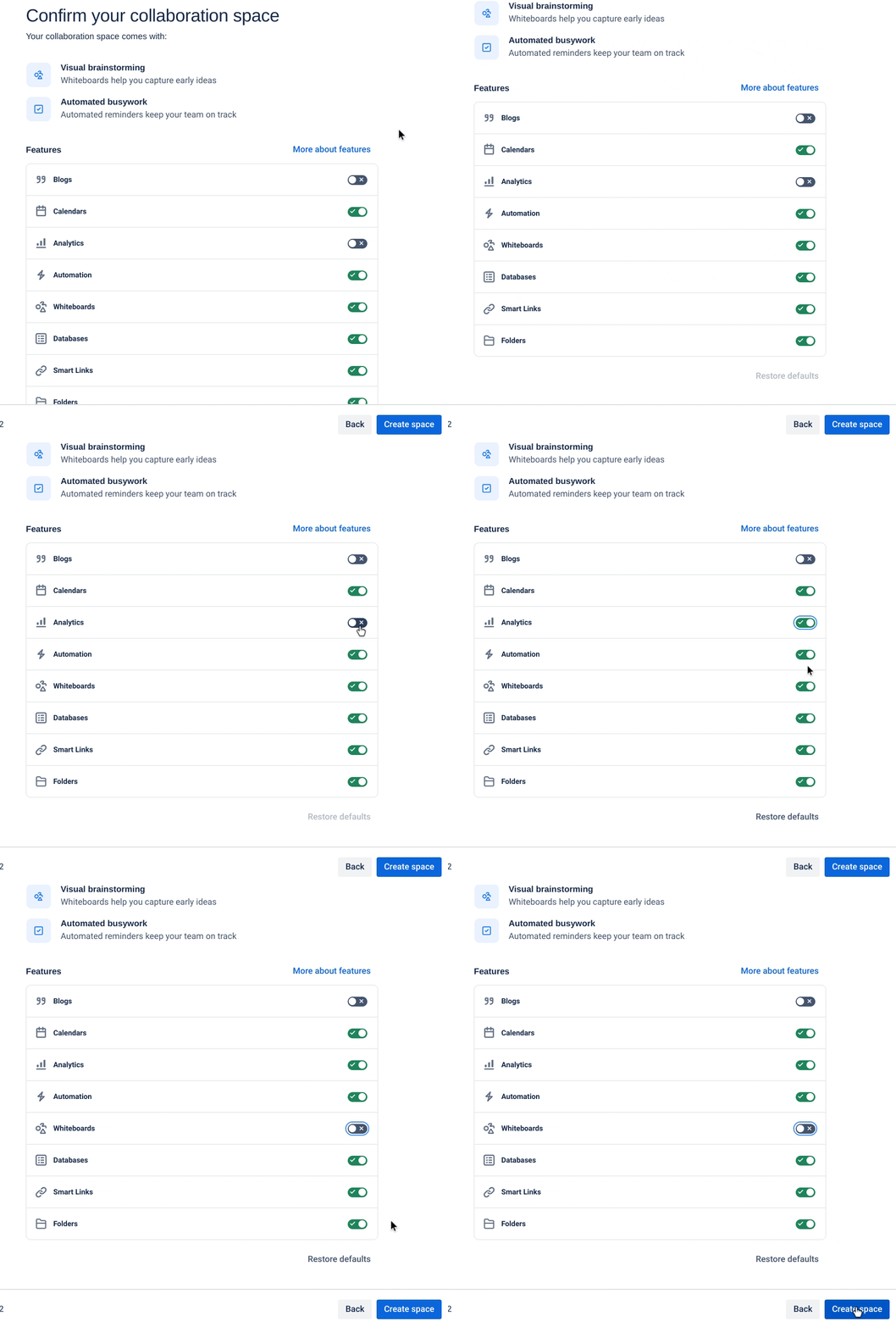
4. Choose which features you’d like your team to have access to in your new space. Below, we’ll share some ideas about what you might like to include.
For more information, read our guide on creating Confluence spaces.
4. Choose which features you’d like your team to have access to in your new space. Below, we’ll share some ideas about what you might like to include.

Toggle on which Confluence features your team needs
Step 2: Add content to your team page
Now you're ready to add content to your Confluence page. Remember the documents and information you gathered before you started? Now’s the time to add it in!
With Confluence's editor, you can add text, images, tables, and more. Or, you can tap into the different Confluence macros available to add dynamic content like calendars, task lists, or Jira issues.
With Confluence's editor, you can add text, images, tables, and more. Or, you can tap into the different Confluence macros available to add dynamic content like calendars, task lists, or Jira issues.
What can you include in your team page?
- A directory listing your team members, their roles, and how to contact them
- Details or a description of your team
- Your team mission and goals
- A calendar of important dates
- A feedback/comments box
- A 'Resources' section with links to important files and documents
Let’s go into more detail on a few of these:
Team directory: This is a great way to keep everyone up-to-date on who each team member is and how to get in touch. Be sure to include their name, role, responsibilities, and contact details like an email address.

A team directory helps users know who's on your team and how to contact them
Team calendar: If you've toggled calendars on, you can get started by clicking 'Calendars' in your space sidebar.

Next, click 'Add new calendar', or if you’ve already got a calendar good to go, you can add this instead.

Keep team members in the loop with a calendar of important dates
With your calendar added, go ahead and add any upcoming events or deadlines. You can choose from monthly, weekly, or list views.
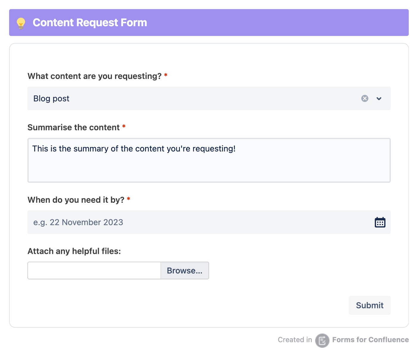
Comment or submission box: Using an app like Forms for Confluence, you can easily embed a form on the page to welcome comments and suggestions. For team pages like 'Content Creators United', you could even create a submission box for new marketing content ideas!
Comment or submission box: Using an app like Forms for Confluence, you can easily embed a form on the page to welcome comments and suggestions. For team pages like 'Content Creators United', you could even create a submission box for new marketing content ideas!

A comment box or form can help users provide suggestions or get in touch
Step 3: Customise your team page
So you’ve got the barebones content of your team page - now you need to make sure users actually engage with it. The best way to do that is with the help of Confluence macros.
What you can achieve with Confluence’s built-in macros is limited, but here are a few macro ideas to get you started:
What you can achieve with Confluence’s built-in macros is limited, but here are a few macro ideas to get you started:
- Panel macro: Use this macro to highlight headings and text in Confluence.
- Layouts macro: Improve the page structure by splitting it into sections.
- Expand macro: Put lengthy content inside a collapsible section to keep the page neat and tidy.

Divide your team page into sections with the Confluence Layouts macro
Can't achieve your vision with Confluence's out-of-the-box features alone? A third-party app, such as Mosaic: Content Formatting Macros & Templates, gives you all the tools you need to structure and style your team page however you want.
Bonus: Get our team page template
As we’ve already shown you, Confluence templates are a great way to set up pages quickly and effortlessly. We've created a team page template that's easy to navigate and very engaging, meaning users will actually read and remember the content you put on the page.

Our template helps you elevate your team page with ease
To get started, install Mosaic, then head to our Confluence team page template and follow the instructions. It couldn't be simpler!
What are the benefits of creating a Confluence team page?
While there are many advantages to building a team page in Confluence, here are a few of the top ones:
A window into your team and organisation
By creating a central location for all your team's information, your Confluence team page is the go-to place for everything they need to do their jobs well. As well as contact details for individual team members, you can include project documentation, meeting notes, planning documents, and even team updates on your team page.
Connect and collaborate wherever you are
Confluence allows you to customise pages and spaces to suit your team's needs. You can use ready-made Confluence templates to keep things consistent, or you can use Confluence macros to make the space your own and provide a warm and welcoming environment for team members.
Create a vibe that suits your team and culture
Confluence allows you to customise pages and spaces to suit your team's needs. You can use ready-made Confluence templates to keep things consistent, or you can use Confluence macros to make the space your own and provide a warm and welcoming environment for team members.
Ready to wow your team?
Your team page should be dynamic, not static. It should always reflect what your team is working on and what matters most to them. Keeping information fresh and flowing in this way will ensure every team member feels connected, valued, and most importantly, motivated to succeed (and stay).
Try Mosaic and create outstanding, engaging team pages.
Written by

Content Marketing Manager
As an experienced Content Marketing Manager, Holly focuses on educational, accessible guides that help users understand their tools better and get more out of their workday.


