A little planning is needed to create engaging, informative, and practical pages. With these 10 helpful tips, you can make the most of Confluence formatting.
Nobody wants to sift through a boring, cluttered Confluence page. If you want your team to actually read and remember your content, thoughtful design is key. Here’s how to create pages that are as engaging as they are informative.
Want to improve the layout of your pages? Read our guide to creating a clearer
Confluence page structure.
Why is it important to thoughtfully format content?
By planning the way you format your Confluence pages, you can:
- Increase visual interest: Capture attention with images and engaging layouts
- Improve navigation: Help users find what they need without endless scrolling
- Highlight important information: Make important messages at CTAs stand out
- Save space: Ensure that your page looks clean, organised, and easy to read
10 Confluence content formatting tips
1. Add images and other media to spark interest
Images, GIFs, and embedded videos all add extra visual interest, provide essential context, and break up walls of text. Use them to demonstrate a process, add personality, or just make your page a bit prettier!
…but use them sparingly
Balance is key. Too many visuals can be overwhelming and distracting. Use media to enhance your message, not replace or obscure it.
2. Create visual hyperlinks with buttons
Confluence buttons (included with
Mosaic for Confluence) are useful for drawing users' attention to hyperlinks that might otherwise be skipped over. You might use buttons to link to extra information, other product pages, or forms and surveys.
Learn more: How to create Confluence buttons3. Create a table of contents to boost page navigation
Adding a table of contents at the top of your Confluence page acts as a roadmap. It gives users an instant overview of the document and lets them jump directly to the section they’re interested in.
4. Draw attention to messages with interactive banners
An interactive banner sits at the top of your page to grab immediate attention. It's perfect for important announcements, sign-ups, or alerts that every visitor needs to see before they start reading. Get interactive banners with
Mosaic for Confluence.
Follow our simple steps to
create an interactive banner for yourself.
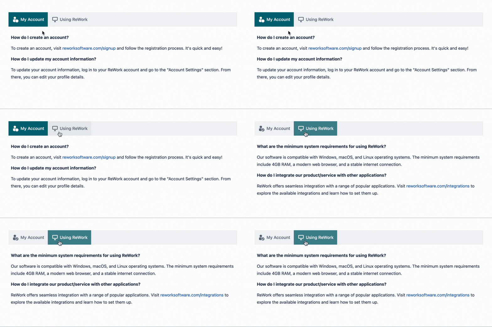
5. Give users the power to select information with tabs for Confluence
Tabs (included with
Mosaic) let you organise large amounts of content into neat, clickable sections. This reduces page clutter and lets users quickly switch between topics, finding exactly what they need without scrolling through irrelevant info.
6. Easily compare and display data in tables
Whether you want to share pricing options, organise data, or track projects, tables are a great way to display information neatly. As well as keeping your Confluence page tidy, tables help users to find and compare information at a glance.
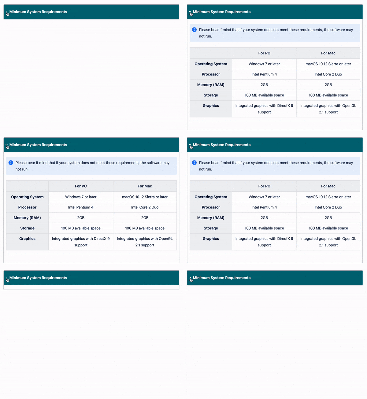
7. Use collapsible sections to save space
Collapsible sections allow you to include all of the valuable information on your page without compromising the user experience.
While Confluence has its own macro for
collapsible sections (called the Expand macro), you can level up your formatting game with the Advanced Expand macro offered with
Mosaic. This clever macro opens up new possibilities for what kind of content you can expand and hide on your pages - including tables, and other in-built Confluence macros.
8. Format headers consistently
Be consistent in how you format headers (and the rest of your text) to avoid confusion for your users. For example, you might introduce all your main points in Heading 2 and your sub-points in Heading 3.
9. Create striking sections with backgrounds
While you can’t change the background colour of an entire Confluence page, you can create vibrant, distinct sections using the Background macro included in
Mosaic. Using a
background colour helps you:
- Create a strong brand identity
- Boost the visual appeal of your page
- Organise information clearly into structured blocks, improving scannability
10. Take advantage of ready-made templates
Why build from scratch when you can start with a pro design?
Templates save time and ensure consistency across your team’s documentation.
While Confluence's built-in templates are a good start,
Mosaic offers templates pre-loaded with the engaging features we've mentioned, such as tabs, buttons and backgrounds. This gives you a head start on creating pages that look polished and professional.
TL;DR
- Built-in Confluence Cloud features, such as a table of contents and tables, can add more structure to your pages.
- Images and media can help to break up walls of text and add extra context, but don't go overboard, or it'll actually make the page more overwhelming.
- Mosaic for Confluence includes a range of macros designed to improve your content formatting. Background macros help you create visual sections, whereas Tabs and Advanced Expand macros tidy your text away into neat sections.
- To save yourself even more time, templates from Confluence can help you create structure in a fraction of the time. Confluence Cloud's built-in templates offer limited formatting features, but Mosaic's templates are polished and professional.
Your Confluence pages, but better
Give your Confluence pages the love they deserve. Discover Mosaic today and start building pages that users care about.


